Showing posts with label Amal Saleh. Show all posts
Showing posts with label Amal Saleh. Show all posts
Friday, 24 January 2014

Final progress review
This year i've managed to successfully complete all my blogs that was required of me. I have progressed a lot this year and I can confidently use different softwares and apps to post on blogger. Overall I have used a variety of different ICT on my blogs.

At the beginning I was quite slow with my blogging, however during the end I managed to improve and started to blog on time and regularly because I started to get used to blogging. I have completed my research, planning, production and evaluation stages.
Finally I would give myself a 8 out of 10 for keeping up with my blogging tasks.
Evaluation- Question 4
Finally, Im very proud of the work I've created and I learnt a lot from the mistakes I've done on my ancillary work and music video.
If I could change anything from the music video, i would probably stick to a few locations because i found out from my audience feedback that people didn't understand why we chose all the these locations. Although we picked it for a valid reason, its still important that the audience could relate to the music video.
One thing I could change from my ancillary work is too make the text a bit larger. I found that most of my audience feedback commented on this.
I learnt a lot from my audience feedback and it makes me see my video and ancillary work from their perspective and although Im very proud of my work, i realise that there is certain parts i could improve on.
Thursday, 23 January 2014
Monday, 20 January 2014
Monday, 13 January 2014
Sunday, 12 January 2014

Planning- Shortlist of fonts, colours, layouts and design ideas
Shortlist of fonts


- Ignatz- I decided to use this font, because it looks more fun and its stands out
- lucida handwriting- I choses to use this on the more formal writing in stead of the heading
- Arial- I didn't chose to use this font because it looks too formal
- Times- I didn't use this font because it made the ancillary product look too boring
Shortlist of Colours
- Pink- I chose to use pink because it suited a girl group style. However i didn't use the colour a lot otherwise it would look too childish.
- Black- I chose to use black for the text
- Grey- I chose to use grey for the background colour.
Shortlist layouts
- Landscape poster-I choses to have a landscape poster because it allowed me to be creative with my design
- Portrait poster- I didn't choses to create a portait poster because i didn't like that layout.
Shortlist Design
- Balloon on ancillary product- To link to music video
- Group image on centre
Saturday, 11 January 2014


Friday, 10 January 2014
Planning- Photography - Location Choice
Photography - Location Choice

http://www.photovisi.com/download?id=79d711da-a9a5-467d-a3ab-c56ae49f7ec6&ready=true
We chose to take our photographs in a photography studio behind a white wall.
We chose to take our photographs there because we wanted a white background so that the group would stand out and the clothes won't clash with the background. I wanted a nice simple background instead of a busy one because I didn't want it to take away the attention from the photograph.
The lighting was also great. We had lots of equipments that we used to our advantage whilst taking the photographs in order to make our photos look professional.
In our music video, we shot certain scenes in front of a white wall in the photography studio. Therefore the photo shoot links to the music video.


Digipack- photoshop

I used Photoshop to create my CD cover.
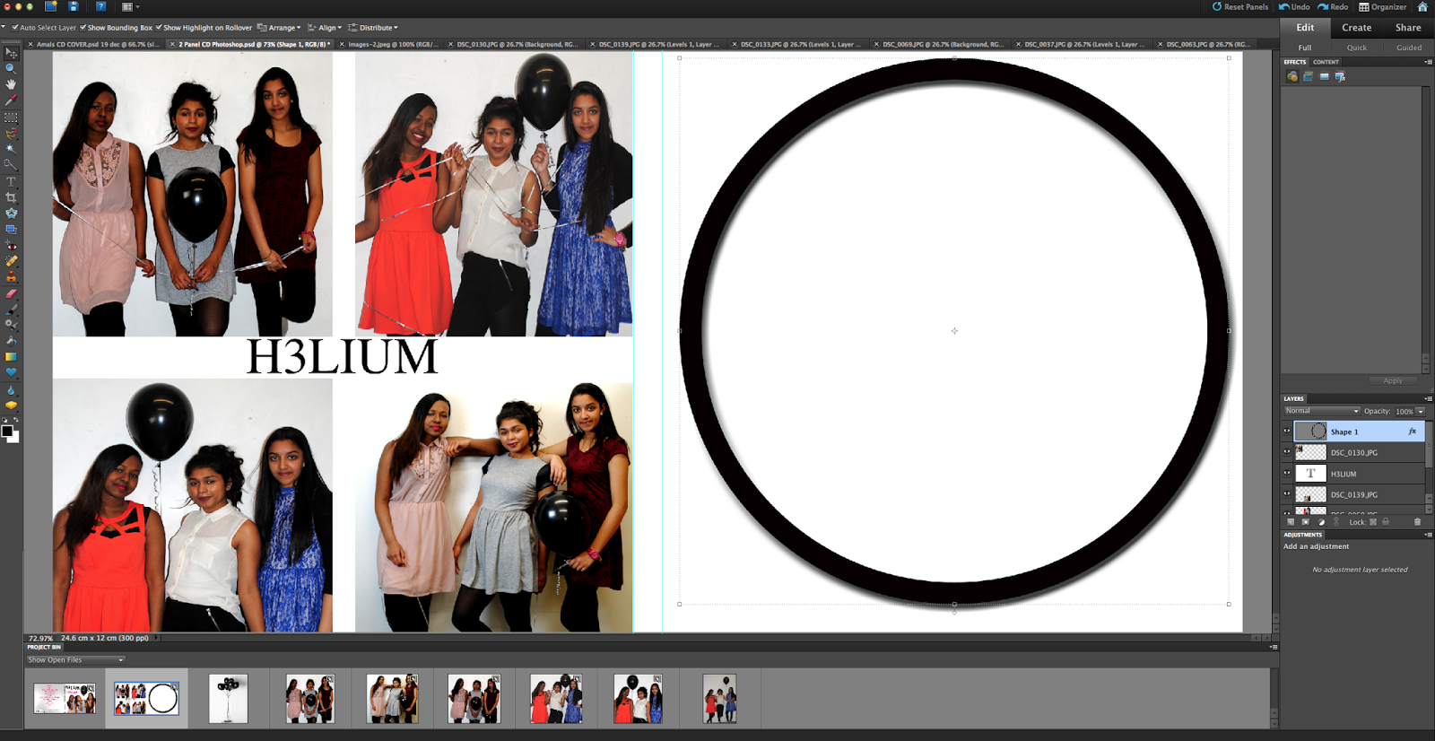
I was using Photoshop to create the inside of my digipack. It was quite difficult to create a circle without a black border, so I decided to fill the circle in black and then write the group name and album name in white.

Thursday, 9 January 2014
Tuesday, 7 January 2014
Possible photos for digipack

I decided to chose this image for my CD cover because it showed the fun side of the group. It also look like a real girl group. The costume in that image linked to the music video and the colours were very light and simple, so that people could focus on the new artists.

At the beginning i felt like this picture would be appropriate for the front cover, because the group was wearing bright clothing, However i decided not to use the image because the group seeped slightly distant and it didn't look like a girl group cover.

This was also another option for the CD cover. I liked this image because of the way the whole group was holding the the balloon. However the reason i didn't choose it, is because the group looked too serious and I wanted to show the fun side of the group.
Possible Photos- Advertisment

I plan to use this image for my advertisment because it looks like a fun, girl group image. We all have the same pose and looking up at the balloon.

I also might use this image for the advertisement because the group are all looking at the camera, with a simple smile and the balloon is at the centre.

This was a possible choice for my Advertisement, however i feel like it wont go well because the group seem slightly distant and the balloon is just left in the centre, unattached to the group.
Monday, 16 December 2013
Digipack- Last year


This my digipack from last year. I learnt a lot from doing this task, for example how to actually structure a CD cover and back. The good thing about this CD cover is that it follows the conventions. However the CD altogether doesn't look professtional and the photoshop skills were bad.
Thursday, 12 December 2013


Subscribe to:
Posts (Atom)